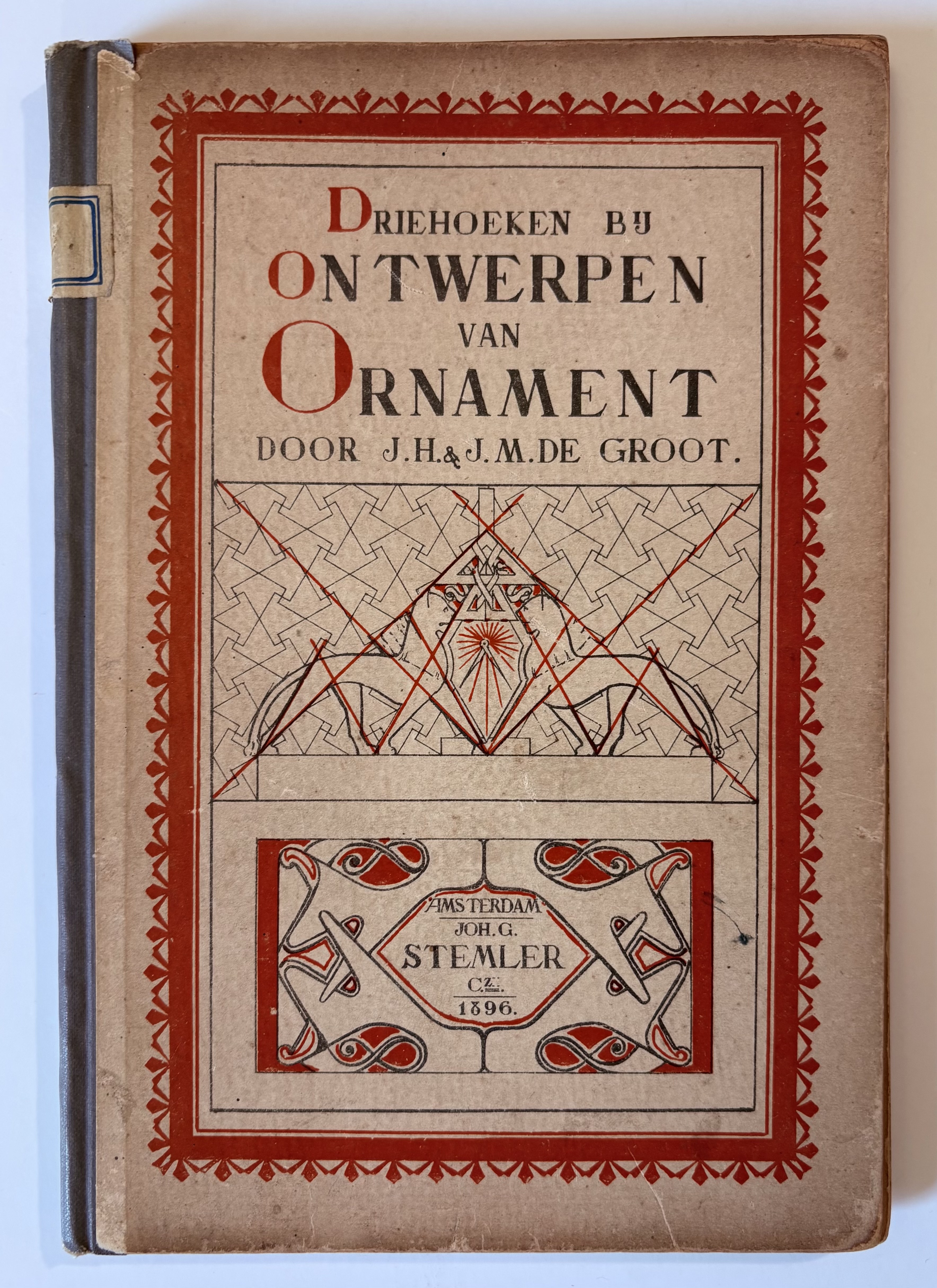
[Triangles for designing ornaments for self-study and for schools] Driehoeken bij ontwerpen van ornament voor zelfstudie en voor scholen.
FULL DESCRIPTION: Dutch Art Nouveau manual
GROOT, J. H. de & JACOBA M. de GROOT. Driehoeken bij ontwerpen van ornament voor zelfstudie en voor scholen [Triangles for designing ornaments for self-study and for schools].
Amsterdam, J. Stemler, 1896.
(19.4 x 13 cm). 32 pp. of text and 52 full-page plates, the last three in color. Original publisher’s printed boards with cloth spine. Library label on the spine and inside front cover, scattered very light spotting, margins show evidence of student handling, and some looseness to the threads, especially at the back of the volume, but a very good copy.
This scarce booklet describes the use of triangles as a basis for designing Art Nouveau ornaments. 'De Nieuwe Kunst' (New Art) is the Dutch Art Nouveau style, characterized by geometric ornamentation and stylized natural designs that employ simple shapes, such as rectangles, circles and triangles as the base units of design.
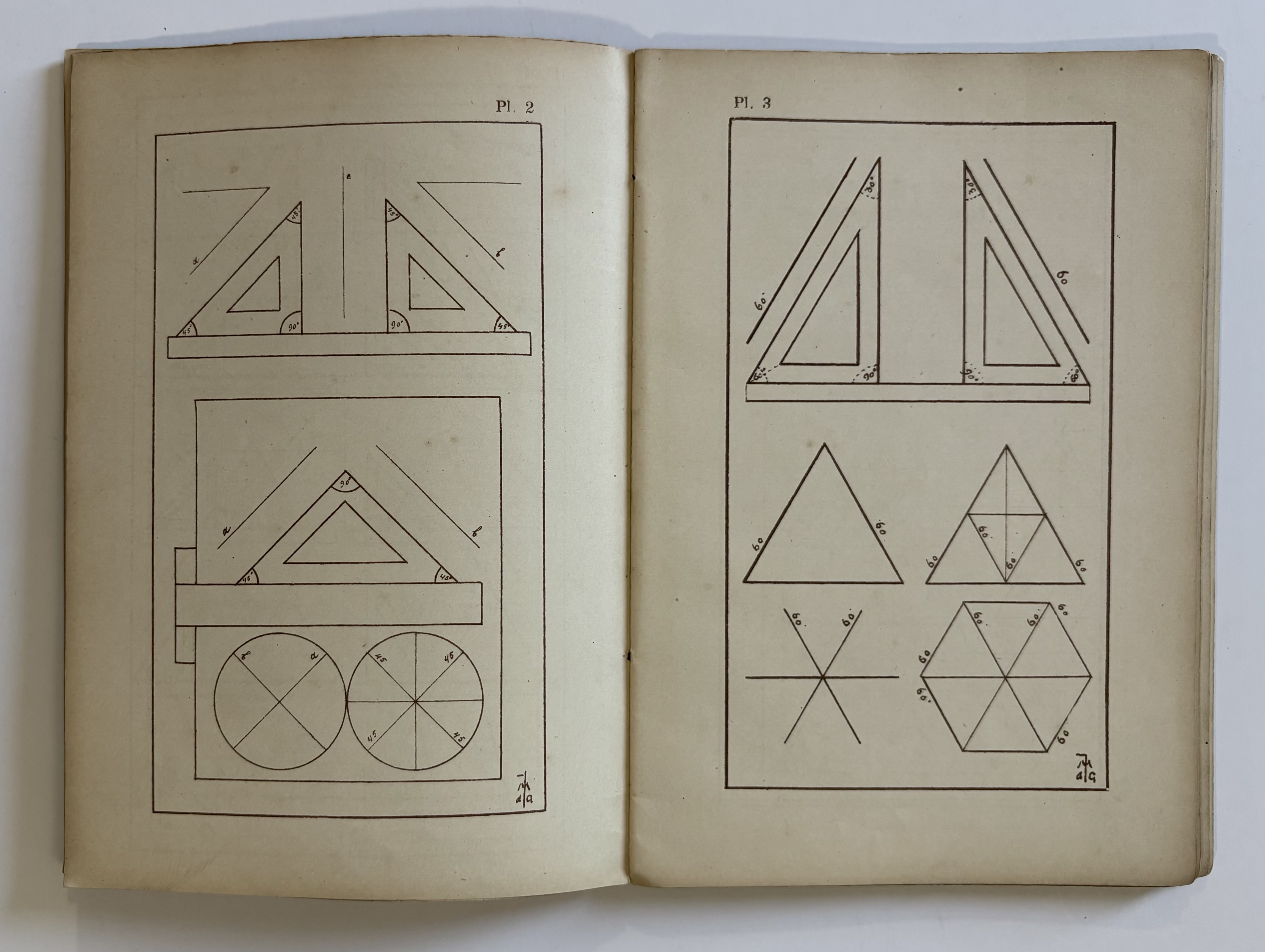
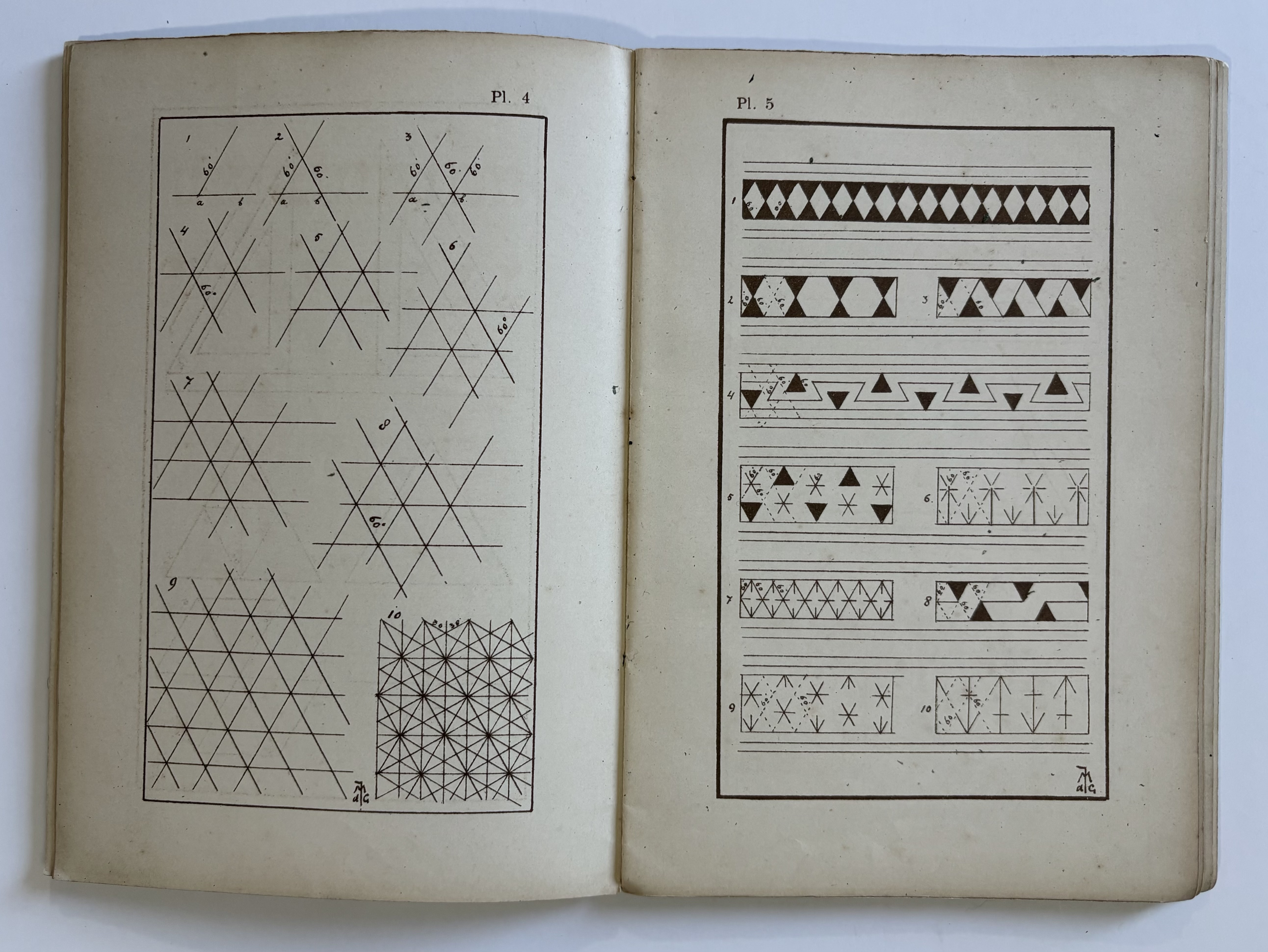
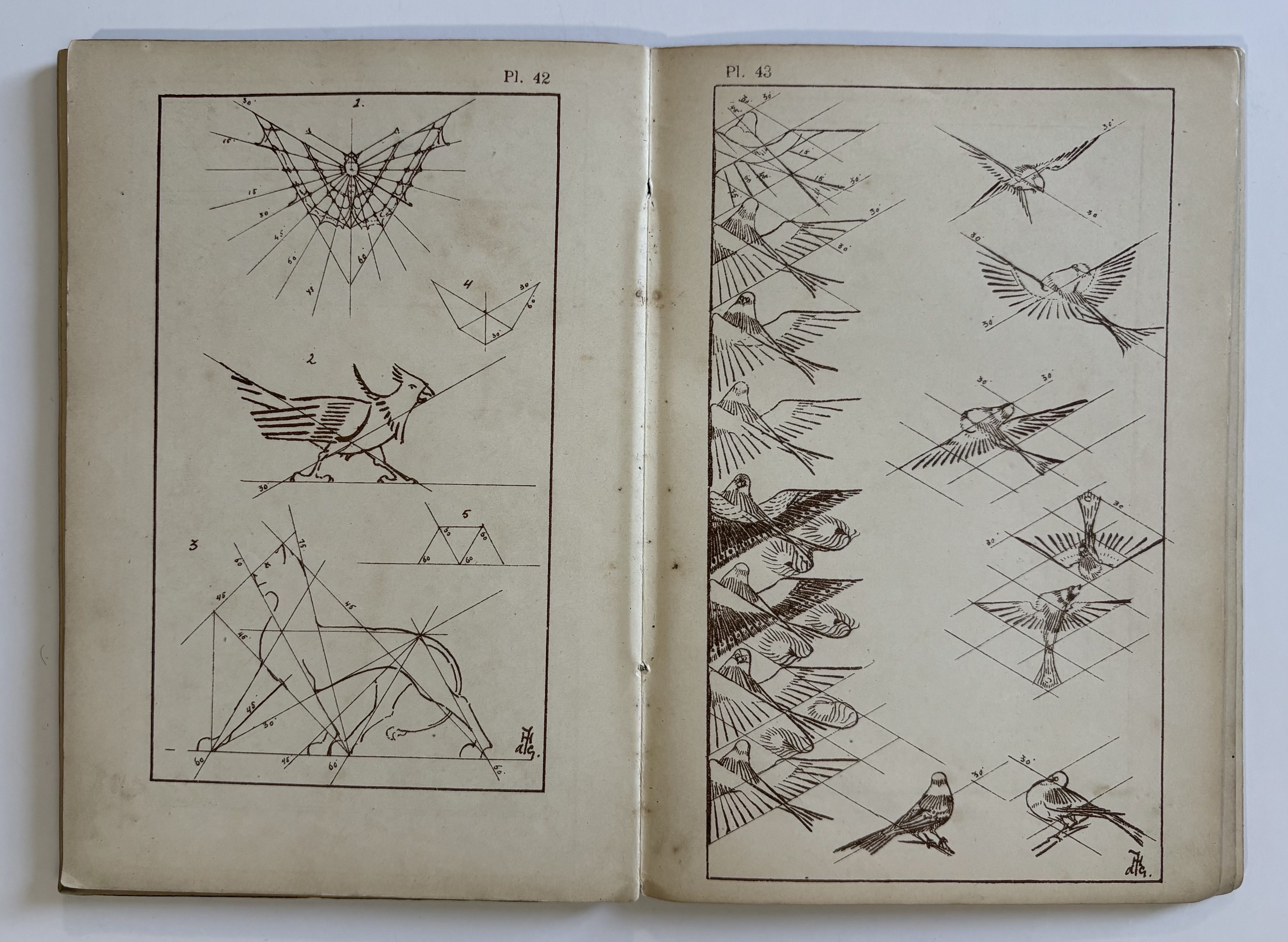
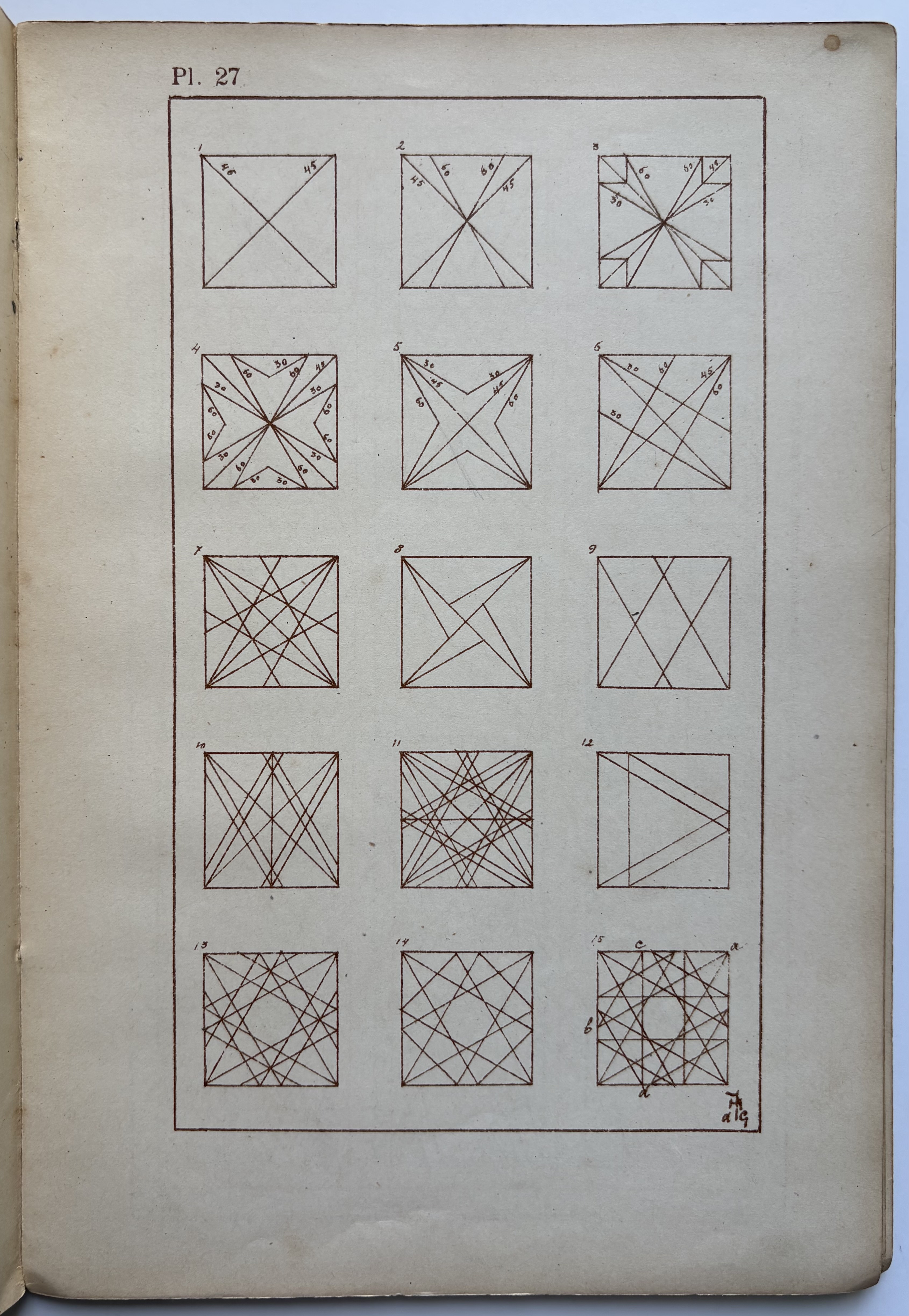
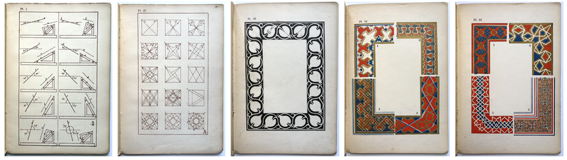
The author tells us in his introduction that he had two goals when producing this manual: one: “to demonstrate the simple genesis of forms and their definitive establishment; and two: to indicate one of the means of preserving unity in an ornamental composition” (tr.) – thus, the manual offers students and artists an uncomplicated methodology toward design. The drawings in the 52 plates were produced, mostly, from using a 45° and a 60° drafting triangle, which allows the accurate rendering of angles at 15º, 30°, 45°, 60°, and 75°. Progressing from simple diagrams of geometric shapes to patterns of more elaborate designs, the drawings also including several alphabets, and three color plates. Each plate is described in detail in the text with instructions on how to understand and execute the designs.
OCLC: 2 copies in the US and less than a dozen in Europe (mostly the Netherlands).
The textual instructions for the plates reveal de Groot’s precise pedagogical method, two examples below with the instructions translated:
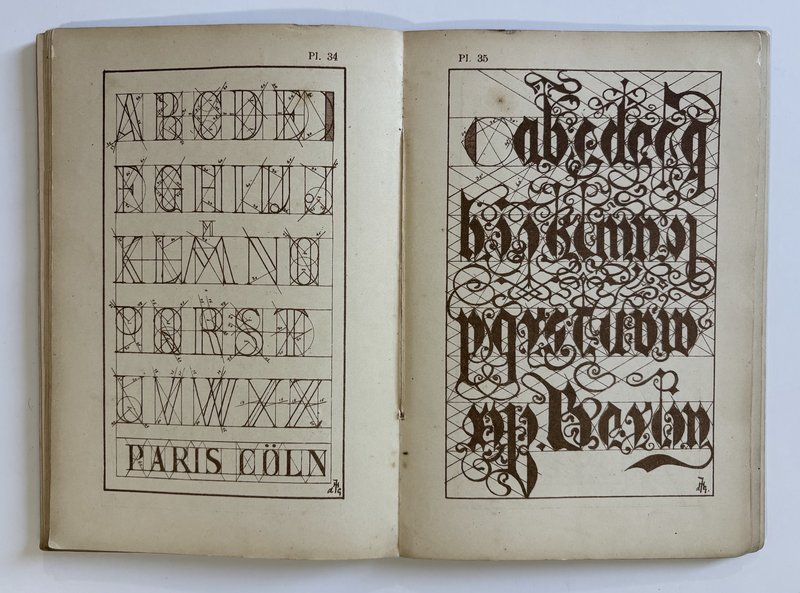
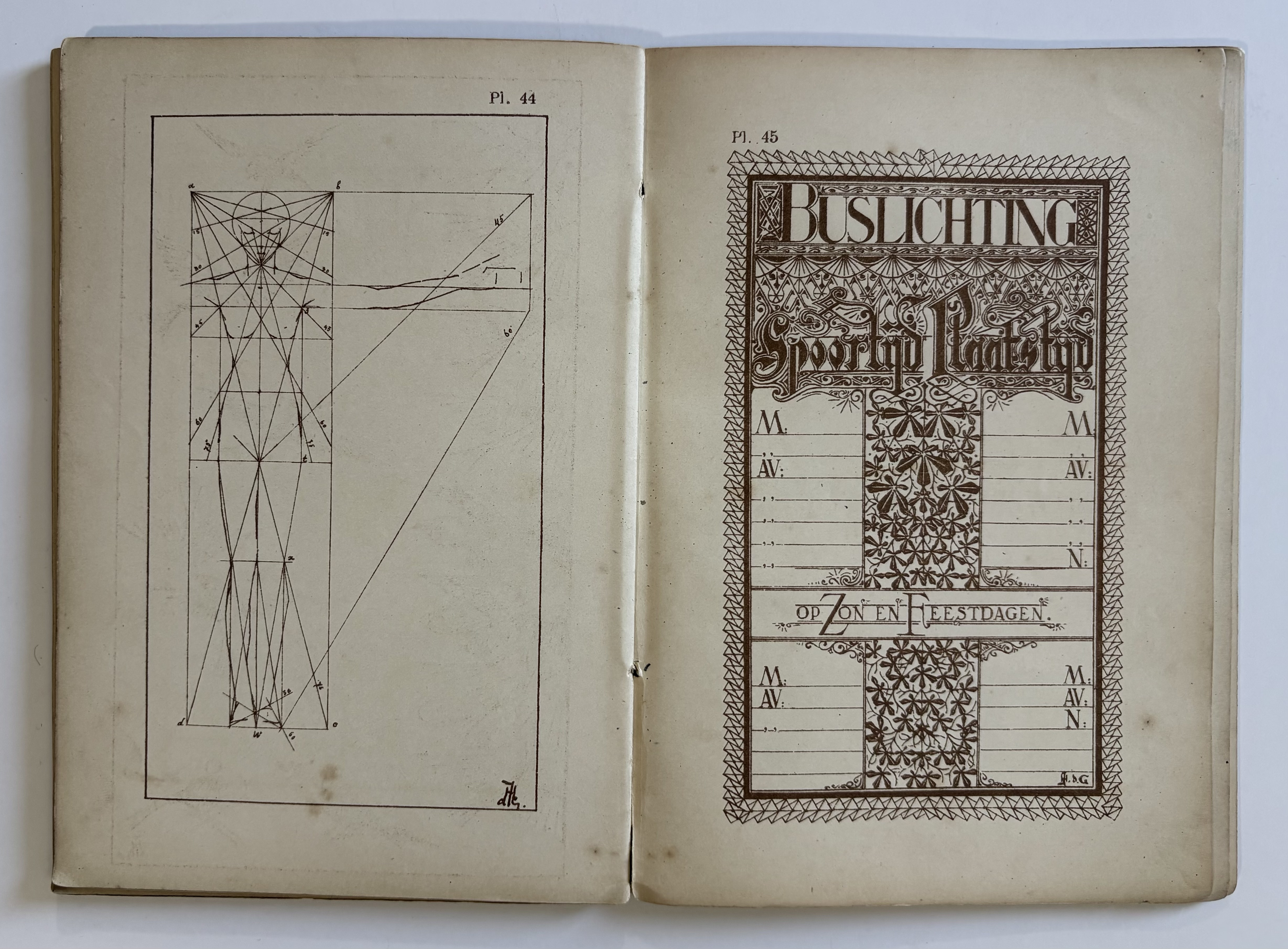
PLATE 34, at left: [p. 28] “Presented here is an alphabet featuring letters of a single style. Note: 1. Each letter is enclosed within a rectangle whose diagonal is set at 60°. The letters W, M, and I are the only exceptions. 2. The figure at the end of the first line—positioned after the letter E—illustrates how to determine the thickness of the letters, as well as the curvature for the letters C, D, and G. 3. All straight lines have been drawn along the edges of triangles, exactly as indicated in Plate 1. A compass was used solely for drawing the circular arcs. The words selected to demonstrate the composition of text are: PARIS and COLN.”
A “helpful tip for printers, lithographers, and draftsmen”.
PLATE 35, above right: [p. 29]: Once again, letters of a single style are presented here. The underlying system of lines is based on angles of 30° and 60°. It should be borne in mind that these are decorative letters, and are therefore not recommended for use in standard, legible writing. The word "Berlin" serves as proof of this. However, this sheet was created to demonstrate that a consistent letterform can be achieved through the application of a single, unified system of lines. To ensure visual unity, it is advisable to adhere—to a greater or lesser extent—to this same system when designing the decorative flourishes. A further observation: the specific tools employed also exert an influence on the character of the lettering. A letter executed with a brush differs distinctly from one written with a pen.
These letters have been constructed using the exact same system as those in Plate 34. Letters derived from a shared system naturally harmonize with one another; thus, this particular typeface can be utilized in conjunction with the style shown in Plate 34. (Refer to Plate 45.) This serves as a helpful tip for printers, lithographers, and draftsmen.”
Jan Hessel de Groot (1864-1932), was a Dutch ceramicist, architect, designer, book designer, art theorist and from 1888 to 1917 a lecturer at the Kunstnijverheid- en Tekenschool Quellinus in Amsterdam. He studied under the Dutch architect, Pierre Cuypers (1827-1921), who designed the Rijksmuseum in Amsterdam. Less is known about Jacoba de Groot, but Lommen’s article provides the following:
“This was a [manual] for schools and self-study by brother and sister Jan Hessel and Jacoba de Groot. Architect Jan was a teacher at the Quellinus school for industrial art in Amsterdam, as the title page states. In compiling the publication, he is said to have approached Lauweriks and De Bazel on several occasions for help. He knew both from Pierre Cuypers’ office. Jacoba attended the art needlework class at Amsterdam’s Rijksschool voor Kunstnijverheid [State School for Industrial Arts]” (see: Lommen, Quaerendo, April 2025).